
Kaiser Permanente
Life Experienced
Kaiser Permanente
Life Experienced
Client
Kaiser Permanente
My role
Lead Product Designer
Responsibilities
Lead team & end-to-end design process
Methods
Design Research
Rapid Prototyping
User Interviews
User Personas
Information Architecture
Wireframes
Journey Maps
Design Principles
Tools
Figma
Miro
Sketching
01 I Overview
Combatting social isolation
in older adults
Combatting social isolation in older adults
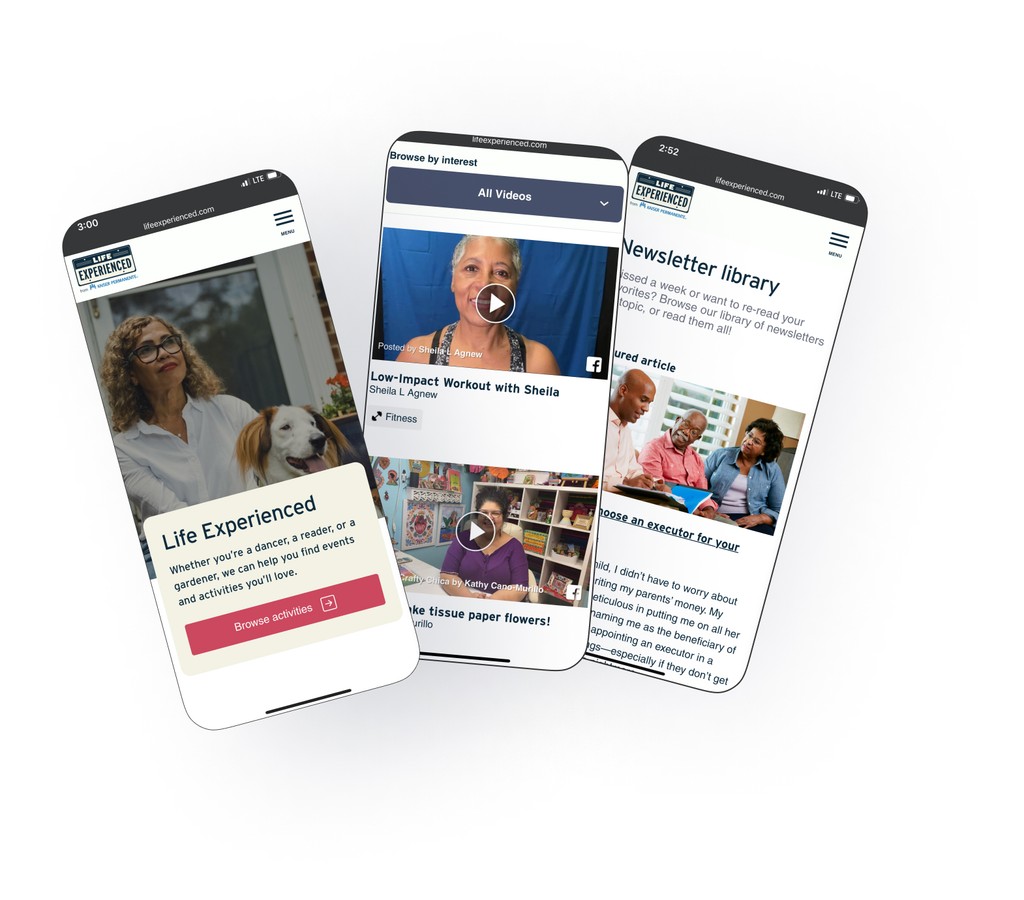
Many older adults suffer from loneliness and isolation, made even worse by the Covid-19 pandemic. My team partnered with Kaiser Permanente to help them connect with their peers.
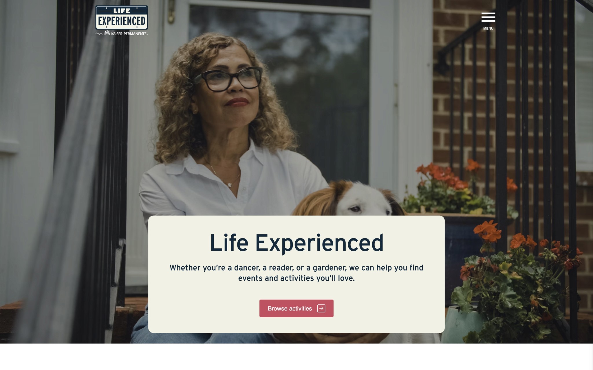
Life Experienced is a place where older adults can go to find virtual and local events, video & newsletter content for people like them.
I led my team in the design and implementation of several new features. and coached them in UX research, rapid prototyping, synthesis, ideation, design and implementation.
I established the first formal end-to-end design process at the organization.
02 I Problem & solution space
02 I Problem & solution space


Problem
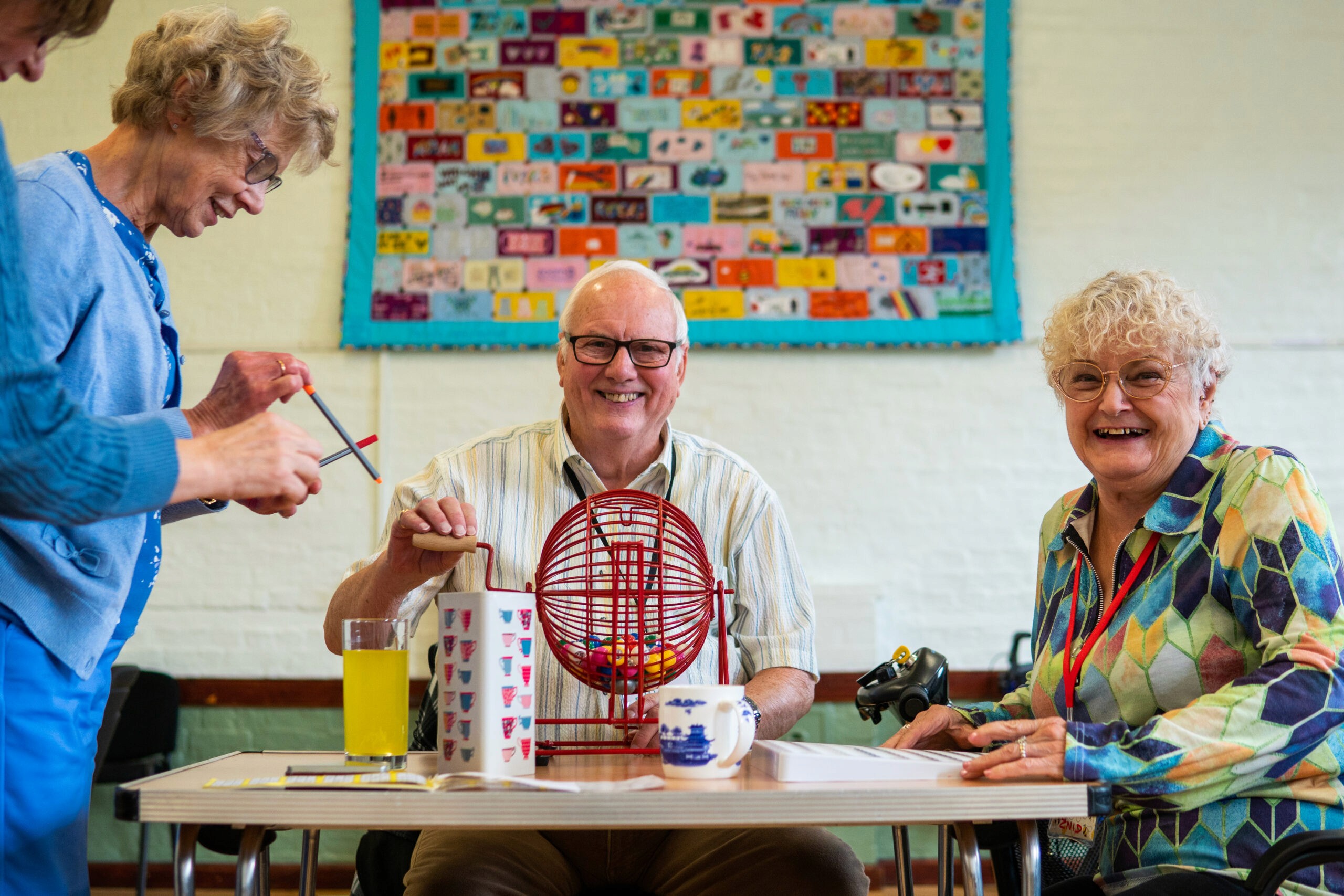
Many older adults suffer from loneliness & isolation. Covid-19 made this even worse.
Older adults need an online resource that helps them connect with other seniors.
Goal
Combat social isolation by providing a way for older adults to connect with each other, improve their relationships & quality of life.
Life Experienced needs more features to expand it’s impact.
Accessibility needs improvement and is particularly important for this audience.
Solution
Search for virtual and local events
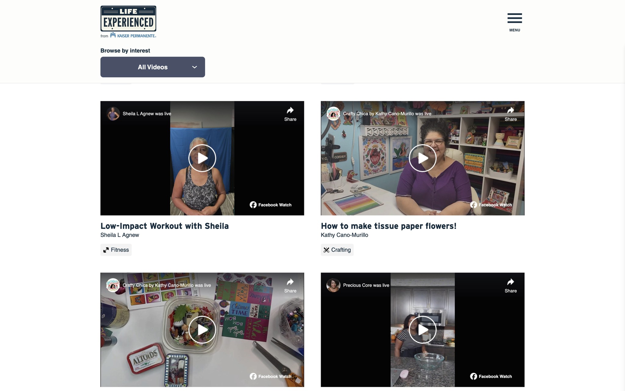
Video library with content from older influencers
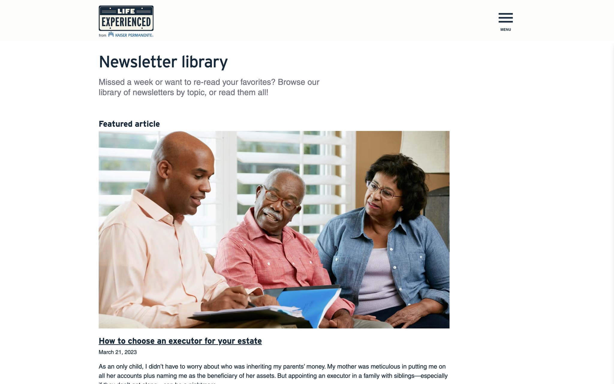
Newsletter blog showcasing content from LE's very successful newsletter
Google Events search tutorial that helps older adults learn a new tool & expands the events LE can connect them with
Outcomes
Successful launch of Video Library, Newsletter Library, and Google Search Integration
Increase in newsletter sign ups
Improved accessibility
03 I Nurturing a growing team
03 I Nurturing a growing team
The Design team at The Public Good Projects was small and relatively new. I was tasked with establishing the organization’s first formal end-to-end design process and coaching the team on how to implement it.
I helped the team grow in knowledge & execution of deliverables & processes

Journey Maps

UI Design

User Interviews

User Personas

Design Frameworks

Accessibility
With my mentorship, the PGP team added new methods & tools to its tool belt.
With my mentorship,
the PGP team added new methods & tools to its tool belt.
Design Research

Rapid Prototyping

Hand Sketching

Design Principles

Affinity Maps

Card sorting
04 I End-to-end Design Process + Rapid Prototyping
Establishing our agency's design procedures
With nothing in place before, I wanted to establish a design process that fit PGP’s
unique needs and rapid timelines. I chose to integrate Rapid Prototyping into the
more traditional Design Thinking framework.
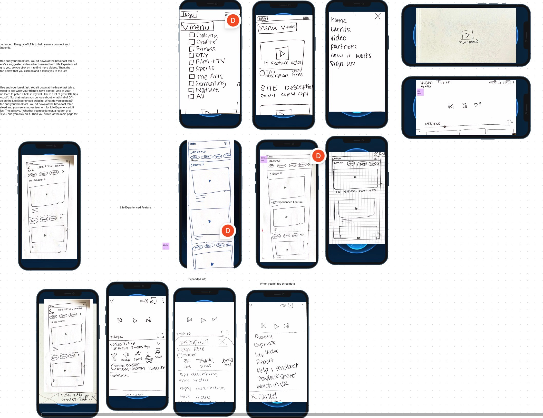
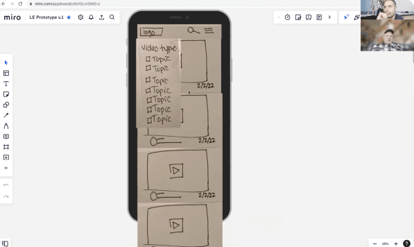
Using the Rapid Prototyping method
Began testing with an MVP right away
Received valuable feedback from users early & often throughout the entire design process
Kept pace with tight timelines
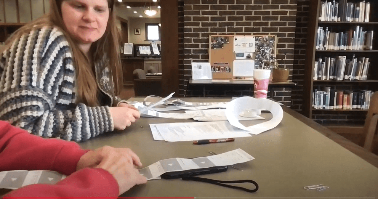
Prototyping methods included: paper, Miro, FigJam, Zoom & Hi-fidelity Figma prototypes
05 I Research & Insights
We got to know older adults
& their unique needs
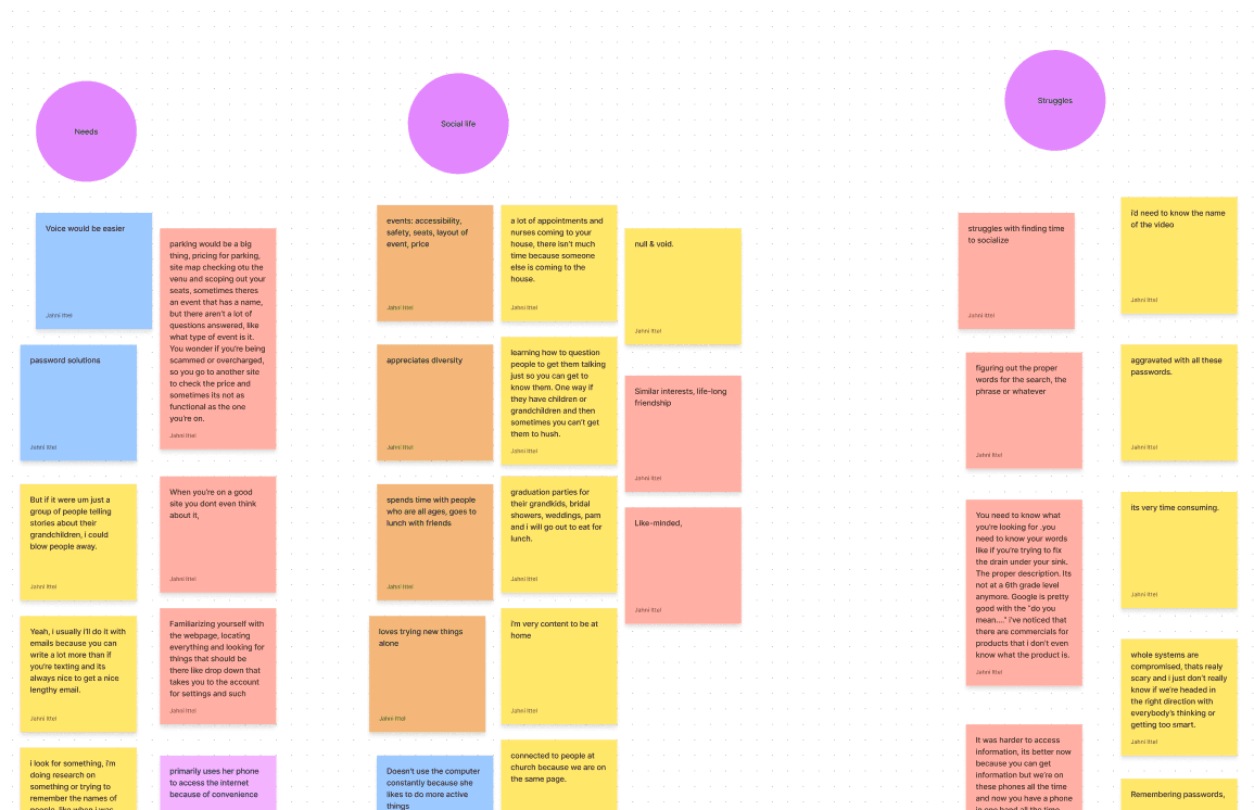
Including older adults in the process was important to us. We held user interviews and prototyping sessions with them frequently.
We also used secondary research, surveys, competitive analysis, affinity mapping, analytics and data coding.

Key Learnings
Older adults go mobile
A majority of older adults primarily access
the web via mobile.
Social media use varies
Some older adults enjoy social media,
but many interviewees rejected the idea or only used it for messaging.


Accessibility is key
As we age, we often need more assistance
with vision, hearing, physical, mental and
other impairments. People often have
more than one impairments.
Tech skills span all levels
Some seniors are tech novices, some
are power users, and some are in-between. Design so that all levels can enjoy.

Orientation & wayfinding
It’s okay to hold their hand. Clear signifiers,
directions, and simple layouts help older
adults reach their goals.

06 I Synthesis
Good ideas come from
good frameworks
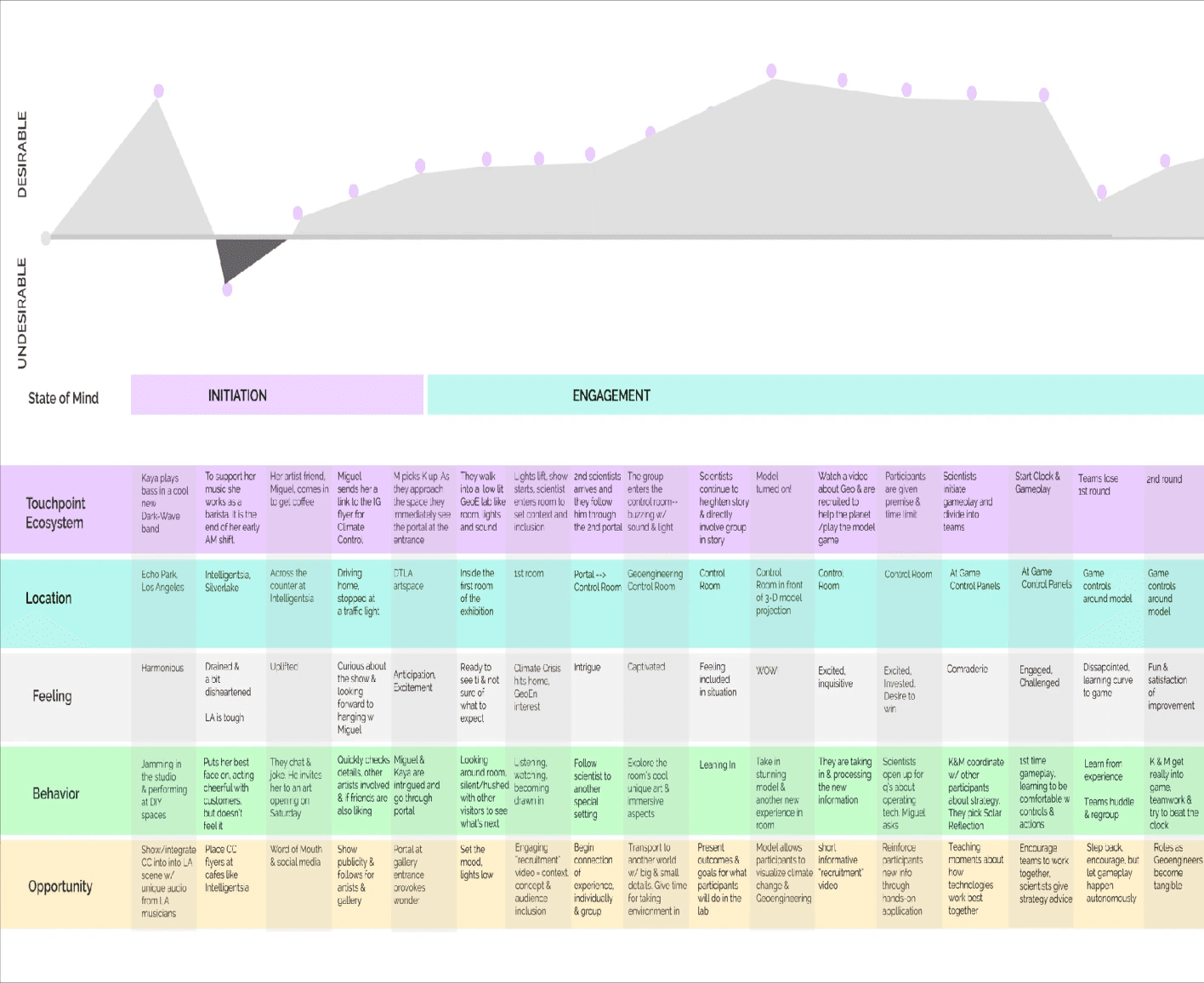
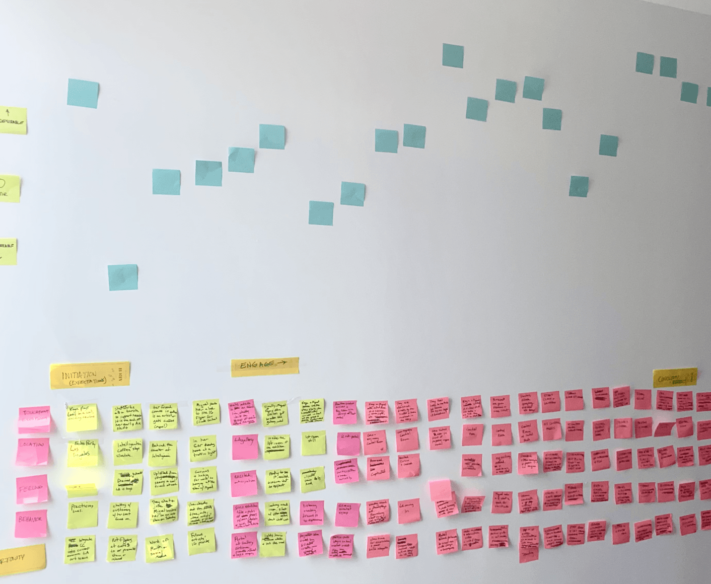
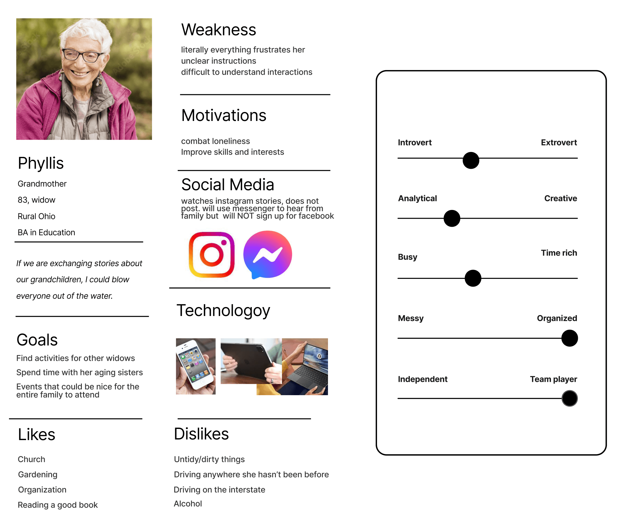
We gained so much valuable understanding of older adults, their connection with others, and their relationship to technology.
How do we make sense of it?
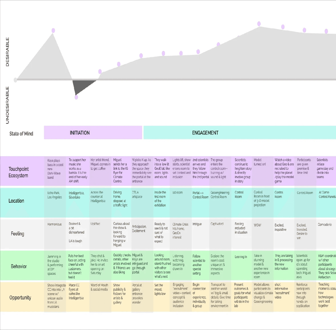
By using design frameworks like user personas, journey maps and design principles, we gained even deeper insights that we could make actionable in our designs.
07 I Design
Our values stand with
older adults
We created design principles that guide our product values and that we
can always refer back to while designing to make sure we stay on target.
These principles help us give Life Experienced users the best
experience possible.
Design Principles

Approachable
Design to be inclusive to a varied range of
technical expertise, physical & cognitive abilities.

Connected
By understanding and representing the unique needs
of older adults, we can connect with their individual
needs and then connect them with each other.

Clear
Signifiers, labels, controls, and directions are
prominent. They hold a user’s hand and make
primary actions explicit.
Accessibility &
design considerations
Our bodies change as we get older. That changes the ways we can use and access
technology, too.
Compounding Impairments
Seniors often suffer from more than one impairment
ex. both poor vision and poor motor control. Ths
It’s important to keep this in mind when meeting
their accessibility needs.
Larger touch points
Buttons and swipe targets should be larger for this audience on mobile.
Increase font size, slightly
Fonts should be increased, but not too much.
Too large of font decreases readability. It also
makes the site more difficult to comprehend
and navigate.
Simplicity & consistency
Simple, uncluttered layouts are easier to comprehend
and navigate. Keep layout, navigation, and interactive
elements consistent across pages and screens.
Learning & retention
Provide training videos, animations or illustrations
to show user show to use the product, such as
control techniques and gestures on mobile.
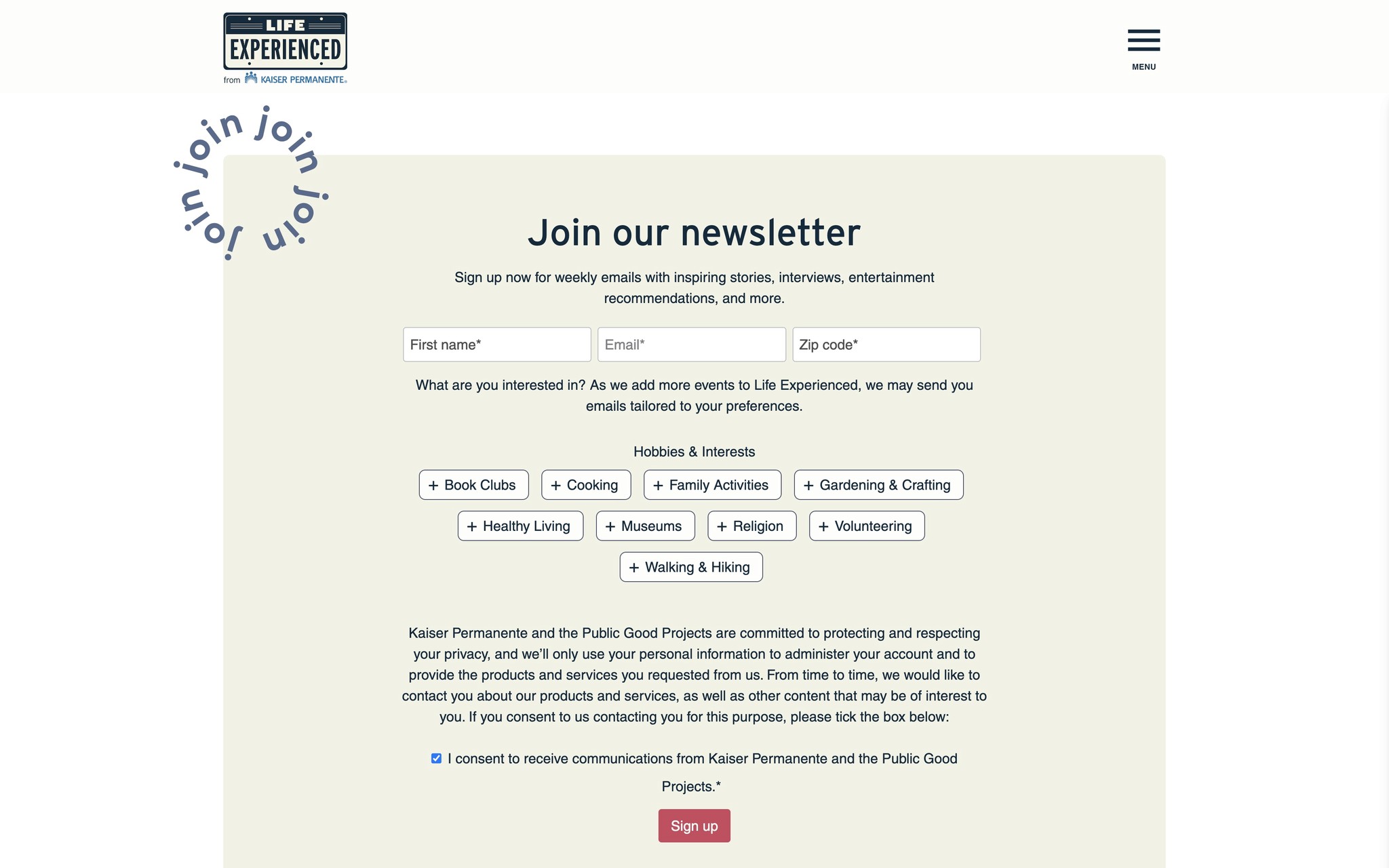
Shipped designs
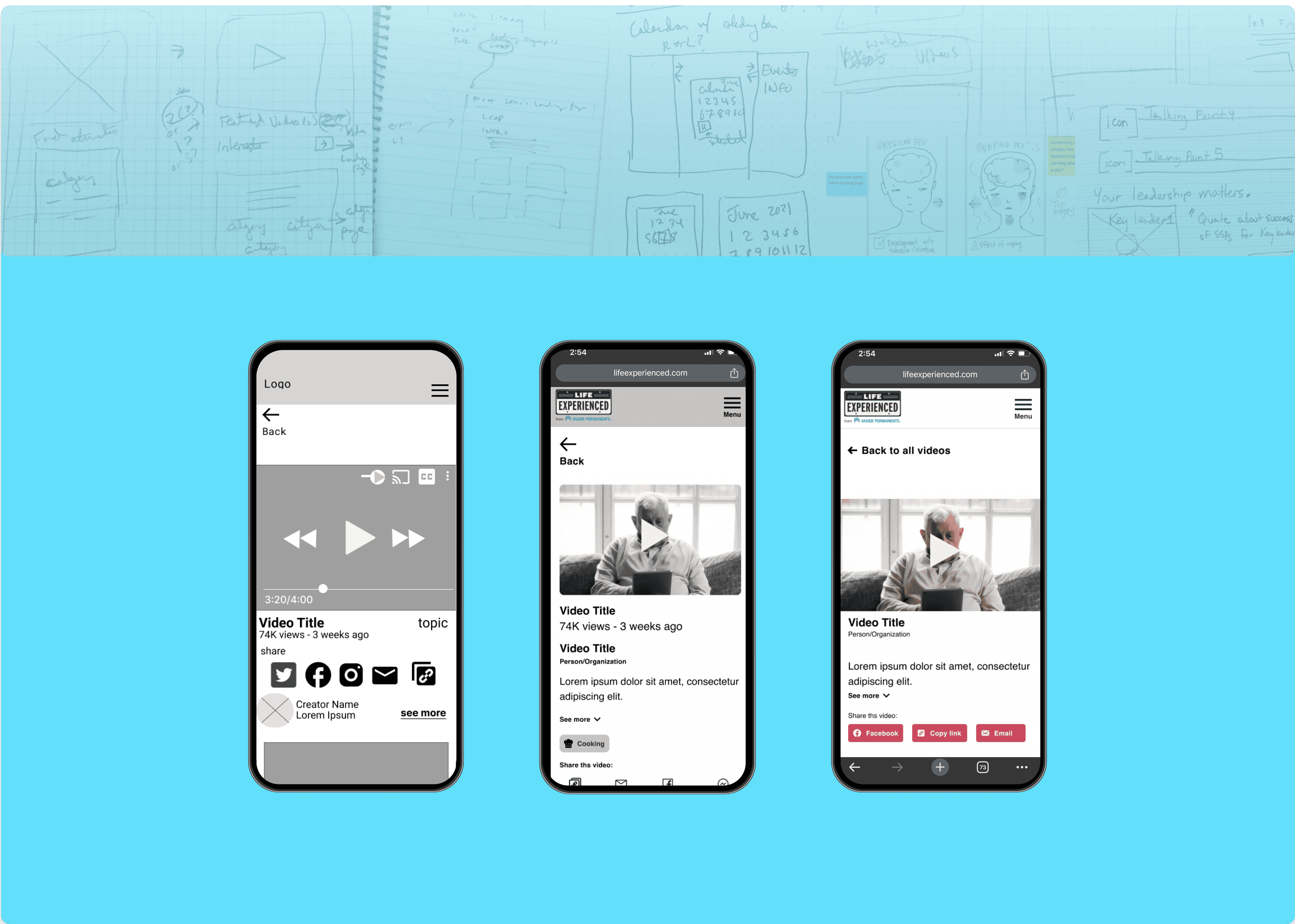
Lo-fi wireframe
Mid-fi wireframe
High fidelity wireframe
Client
Kaiser Permanente
My role
Lead Product Designer
Responsibilities
Lead team
End-to-end design process
Methods
Design Research
Rapid Prototyping
User Interviews
User Personas
Information Architecture
Wireframes
Journey Maps
Design Principles
Tools
Figma
Miro
Sketching


04 I End-to-end Design Process + Rapid Prototyping
Establishing our agency's design procedures
With nothing in place before, I wanted to establish a design process that fit PGP’s unique needs and rapid timelines. I chose to integrate Rapid Prototyping into the more traditional Design Thinking framework.


How we used the Rapid Prototyping method
We began testing with an MVP right away and
received valuable feedback from users early &
often throughout the entire design process.
Test. Reiterate. Test. Reiterate. Repeat. Repeat.
This also helped us keep pace with tight timelines.
Prototyping methods included: paper, Miro, FigJam, Zoom & Hi-fidelity Figma prototypes.
05 I Research & Insights
We got to know older adults
& their unique needs
Including older adults in the process was important to us. We held user interviews and prototyping sessions with them frequently.
We also used secondary research, surveys, competitive analysis, affinity mapping, analytics and data coding.


Key Learnings
Older adults go mobile
A majority of older adults primarily access
the web via mobile.


Social media use varies
Some older adults enjoy social media,
but many interviewees rejected the idea or only used it for messaging.


Accessibility is key
As we age, we often need more assistance
with vision, hearing, physical, mental and
other impairments. People often have
more than one impairments.


Tech skills span all levels
Some seniors are tech novices, some
are power users, and some are in-between. Design so that all levels can enjoy.


Orientation & wayfinding
It’s okay to hold their hand. Clear signifiers,
directions, and simple layouts help older
adults reach their goals.


06 I Synthesis
Good ideas
come from
good frameworks
We gained so much valuable understanding of older adults, their connection with others, and their relationship to technology.
How do we make sense of it?
By using design frameworks like user personas, journey maps and design principles, we gained even deeper insights that we could make actionable in our designs.


07 I Design
Our values stand with
older adults
We created design principles that guide our product values and that we
can always refer back to while designing to make sure we stay on target.
These principles help us give Life Experienced users the best
experience possible.
Design Principles


Approachable
Design to be inclusive to a varied range of
technical expertise, physical & cognitive abilities.


Connected
By understanding and representing the unique needs
of older adults, we can connect with their individual
needs and then connect them with each other.


Clear
Signifiers, labels, controls, and directions are
prominent. They hold a user’s hand and make
primary actions explicit.
Accessibility &
design considerations
Our bodies change as we get older. That changes the ways we can use and access technology, too.
Compounding Impairments
Seniors often suffer from more than one impairment
ex. both poor vision and poor motor control. Ths
It’s important to keep this in mind when meeting
their accessibility needs.
Larger touch points
Buttons and swipe targets should be larger for this audience on mobile.
Increase font size, slightly
Fonts should be increased, but not too much.
Too large of font decreases readability. It also
makes the site more difficult to comprehend
and navigate.
Simplicity & consistency
Simple, uncluttered layouts are easier to comprehend
and navigate. Keep layout, navigation, and interactive
elements consistent across pages and screens.
Learning & retention
Provide training videos, animations or illustrations
to show user show to use the product, such as
control techniques and gestures on mobile.
Shipped designs

Lo-fi wireframe
Mid-fi wireframe
Hi-fi mockup

Lo-fi wireframe
Mid-fi wireframe
Hi-fi mockup


01 I Overview
Combatting social isolation in
older adults
Many older adults suffer from loneliness and isolation, made even worse by the Covid-19 pandemic. My team partnered with Kaiser Permanente to help them connect with their peers.
Life Experienced is a place where older adults can go to find virtual and local events, video & newsletter content for people like them.
I led my team in the design and implementation of several new features. and coached them in UX research, rapid prototyping, synthesis, ideation, design and implementation.
I established the first formal end-to-end design process
at the organization.
02 I Problem & solution space


Problem
Many older adults suffer from loneliness & isolation. Covid-19 made this even worse.
Older adults need an online resource that helps them connect with other seniors.
Goal
Combat social isolation by providing a way for older adults to connect with each other, improve their relationships & quality of life.
Life Experienced needs more features to expand it’s impact.
Accessibility needs improvement and is particularly important for this audience.
Solution
Search for virtual and local events
Video library with content from older influencers
Newsletter blog showcasing content from LE's very successful newsletter
Google Events search tutorial that helps older adults learn a new tool & expands the events LE can connect them with
Outcomes
Successful launch of Video Library, Newsletter Library, and Google Search Integration
Increase in newsletter sign ups
Improved accessibility
03 I Nurturing a growing team
The Design team at The Public Good Projects was small and relatively new. I was tasked with establishing the organization’s first formal end-to-end design process and coaching the team on how to implement it.
I helped the team
grow in knowledge
& execution
of deliverables
& processes

Journey Maps
Journey Maps

UI Design
UI Design

User Interviews
User Interviews

User Personas
User Personas

Design Frameworks
Design Frameworks

Accessibility
Accessibility
With my mentorship,
the PGP team
added new methods & tools
to its tool belt.

Design Research
Design Research

Rapid Prototyping
Rapid Prototyping

Hand Sketching
Hand Sketching

Design Principles
Design Principles

Affinity Maps
Affinity Maps

Card sorting
Card sorting
Key Learnings
Older adults go mobile
A majority of older adults primarily access
the web via mobile.


Social media use varies
Some older adults enjoy social media,
but many interviewees rejected the idea or only used it for messaging.


Accessibility is key
As we age, we often need more assistance with vision, hearing, physical, mental and other impairments. People often have
more than one impairments.


Tech skills span all levels
Some seniors are tech novices, some
are power users, and some are in-between. Design so that all levels can enjoy.


Orientation & wayfinding
It’s okay to hold their hand. Clear signifiers, directions, and simple layouts help older adults reach their goals.


05 I Research & Insights
We got to know older adults &
their unique needs
Including older adults in the process was important to us. We held user interviews and prototyping sessions with them frequently.
We also used secondary research, surveys, competitive analysis, affinity mapping, analytics and data coding.


04 I End to-end Design Process + Rapid Prototyping
Establishing our agency's design procedures
With nothing in place before, I wanted to establish a design process that fit PGP’svunique needs and rapid timelines.
I chose to integrate Rapid Prototyping into the more traditional Design Thinking framework.


The Rapid Prototyping method
Began testing with an MVP right away
Received valuable feedback from users
early & often throughout the entire design
process
Kept pace with tight timelines
Prototyping methods included: paper, Miro, FigJam, Zoom
& Hi-fidelity Figma prototypes
We gained so much valuable understanding of older adults, their connection with others, and their relationship to technology. How do we make sense of it?
By using design frameworks like user personas, journey maps and design principles, we gained even deeper insights that we could make actionable in our designs.
Good ideas come from good frameworks


06 I Synthesis
07 I Design
Our values stand with older adults
We created design principles that guide our product values and that we can always refer back to while designing to make sure we stay on target.
These principles help us give Life Experienced users the best experience possible.
Design Principles


Approachable
Design to be inclusive to a varied range of technical expertise, physical &
cognitive abilities.


Connected
By understanding and representing the unique needs of older adults, we can connect with their individual needs and then connect them with each other.


Clear
Signifiers, labels, controls, and directions are prominent. They hold a user’s hand and make primary actions explicit.
Accessibility &
design considerations
Our bodies change as we get older. That changes the ways we can use and access technology, too.
Compounding Impairments
Seniors often suffer from more than one impairment ex. both poor vision and poor motor control. It’s important to keep this in mind when meeting their accessibility needs.
Larger touch points
Buttons and swipe targets should be larger for this audience on mobile.
Increase font size, slightly
Fonts should be increased, but not too much. Too large of font decreases readability. It also makes the site more difficult to comprehend and navigate.
Simplicity & consistency
Simple, uncluttered layouts are easier to comprehend and navigate. Keep layout, navigation, and interactive elements consistent across pages and screens.
Learning & retention
Provide training videos, animations or illustrations to show user show to use the product, such as control techniques and gestures on mobile.


Client
Kaiser Permanente
My role
Lead Product Designer
Responsibilities
Lead team & end-to-end design process
Methods
Design Research
Rapid Prototyping
User Interviews
User Personas
Information Architecture
Wireframes
Journey Maps
Design Principles
Tools
Figma
Miro
Sketching